On June 5th, 2019, we updated the HathiTrust Digital Library to improve the accessibility.
In the past few months, we have undertaken a comprehensive accessibility evaluation of our digital library. As a result of this comprehensive review, we identified a number of areas where we could improve the HathiTrust website and make it easier for users with disabilities to navigate the website and read books. Read more about our goals and process in our blog post announcing the website update.
Following is a description of the most noticeable changes, with screenshots of the website before and after. In addition to the changes described below, we have done a lot of work to update the underlying code.
These changes add to previously existing accessibility features, which are described at the bottom of this page.
June 2019 Digital Library Changes
- Visual Enhancements
- Buttons instead of tabs
- Search bar becomes a button
- Different locations for some features
- Tab focus
- Accessible popups
- Smaller changes
Visual Enhancements
We increased the base font size for text to 16 pixels throughout the site, which benefits individuals with low vision as well as those who have high resolution monitors that make text look tiny. You can always adjust the zoom level of your browser on your computer. In addition, we’ve ensured that we support the ability to zoom in browsers up to 200%, as recommended by the W3C. The only exception for this is when you open a book, where we have our own zoom feature that allows you to increase the size of the book pages.
Similarly, throughout the site, we increased the contrast of text and elements where they failed to meet accessibility standards previously. We previously had implemented “zebra striping” by alternating the background color for every other row, which can make it easier to scan a long list, but in the update, we’ve added this feature to a few other sections of the site.
Buttons instead of tabs
One of the bigger changes we have made is to remove the tabs that allowed you to switch between Catalog and Full-Text search and to sort search results into “All Items” and “Full View” items (example below). The tabs have been replaced by buttons with the same functionality but a different appearance.
Before
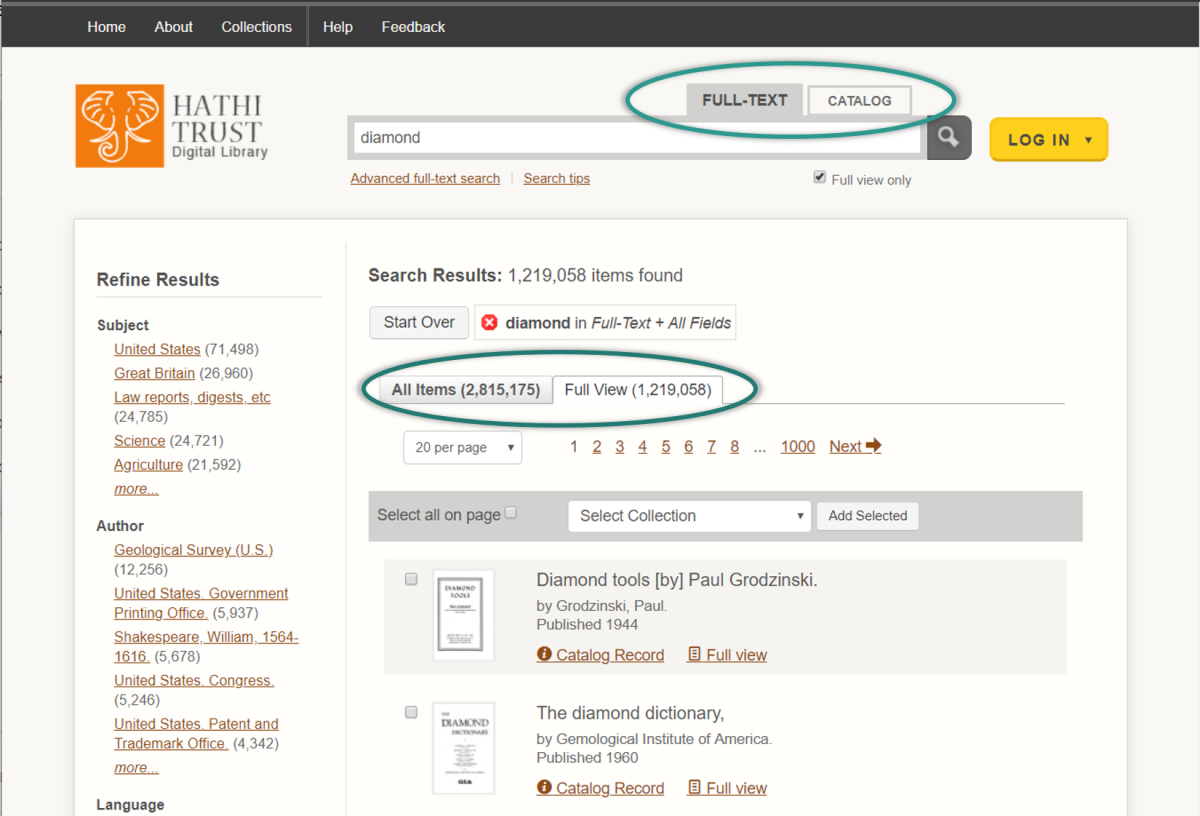
We discovered that the tabs are not fully functional for users navigating with accessibility technology. There is no visual indicator when a keyboard focuses on the search tabs, and screen reader software can’t detect whether the All Items or Full View is currently selected.
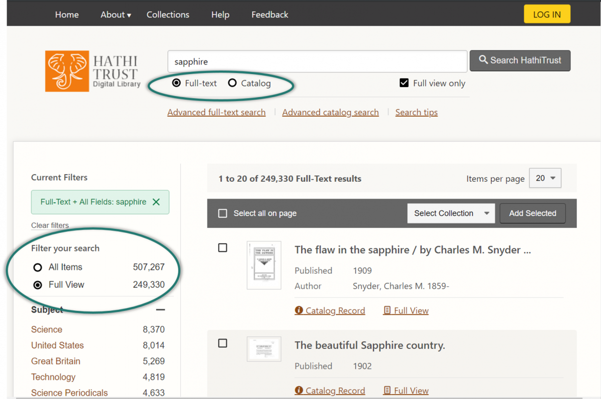
Instead of using tabs, we have switched to buttons, as in the following examples. You are able to toggle between Full-Text and Catalog search using the buttons beneath the search bar, which are more detectable to screen reader software. You can also switch between whether you wish to receive All Items or just Full View items in your search results by using the buttons in the “Filter your search” section. If you prefer to always search for only full view items, you can still select the “Full view only” checkbox underneath the search bar, which is sticky through all searches.
After
Search bar becomes a button
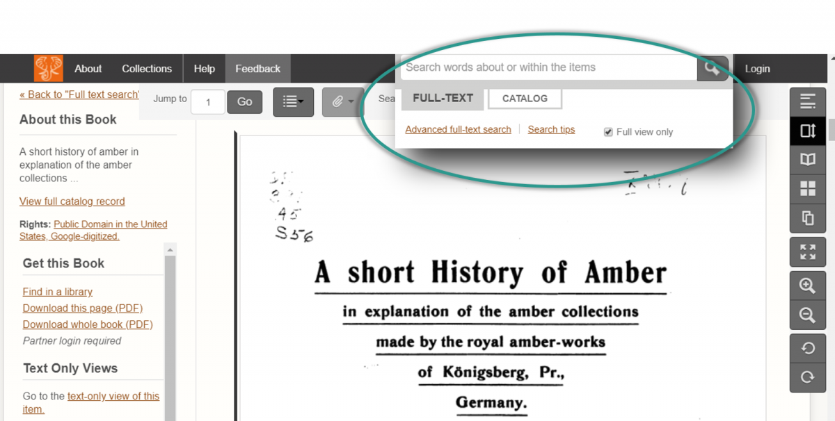
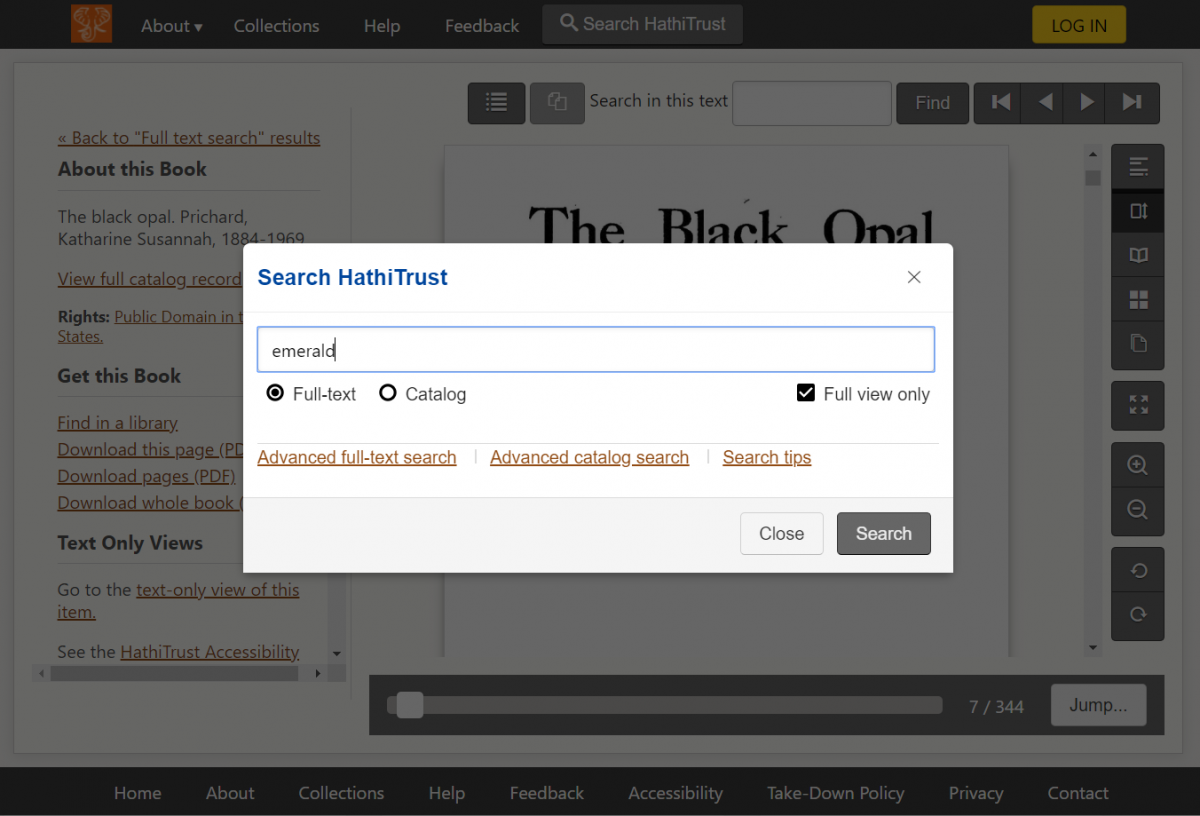
As a result of the above change to replace tabs with buttons, when you are reading a book, the field that allows you to search in the HathiTrust collection has been changed into a button. When clicked, the button opens a search form that allows you to switch between Full-Text Search and Catalog Search. In other parts of the Digital Library where we have more screen space, this remains a search field.
Before
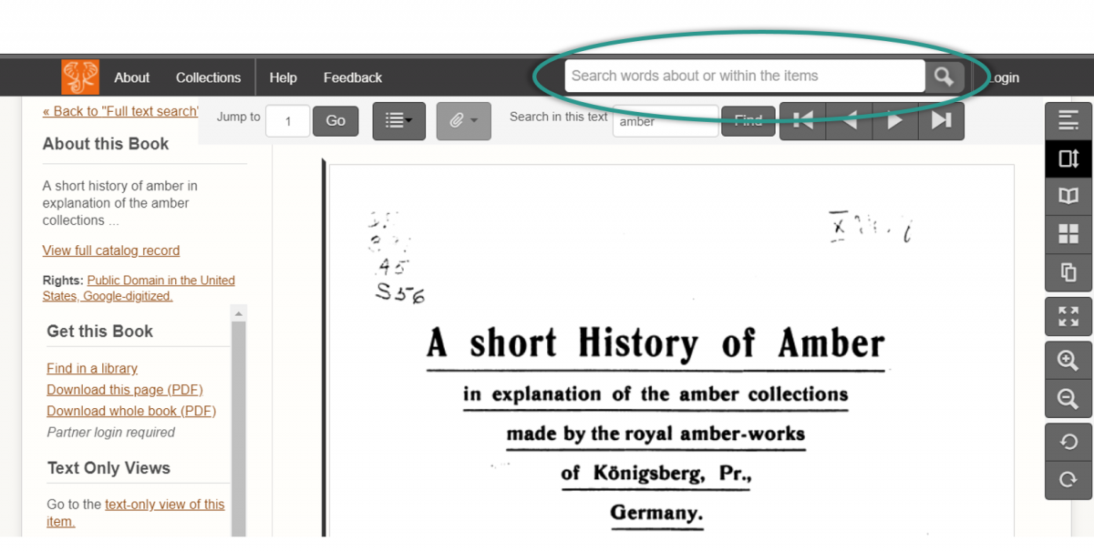
When you clicked into the search field, more options would become available.
After
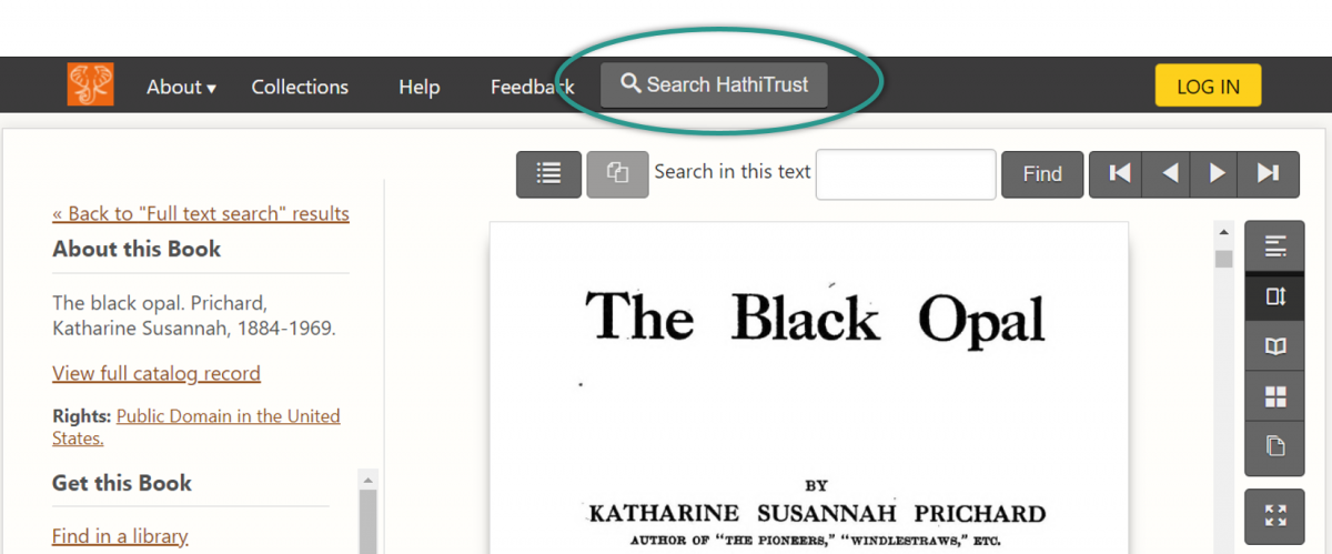
Now, to search within the HathiTrust collection after you’ve opened a book, you can click the Search HathiTrust button in the header navigation bar.
When you click the Search HathiTrust button, an accessible search form loads above the book. You can switch between Full Text and Catalog search and take advantage of other search features from this popup.
Different locations for some features
If you use a keyboard or accessibility technology that depends on keyboard navigation (e.g., a screen reader or a refreshable braille display), you may notice that it is quicker to get to key content on the page. As we reviewed the navigation order of the website, we determined that it made sense to move certain features that are less important and may interrupt your reading experience.
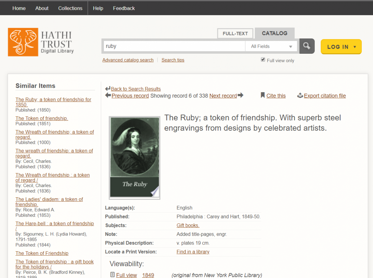
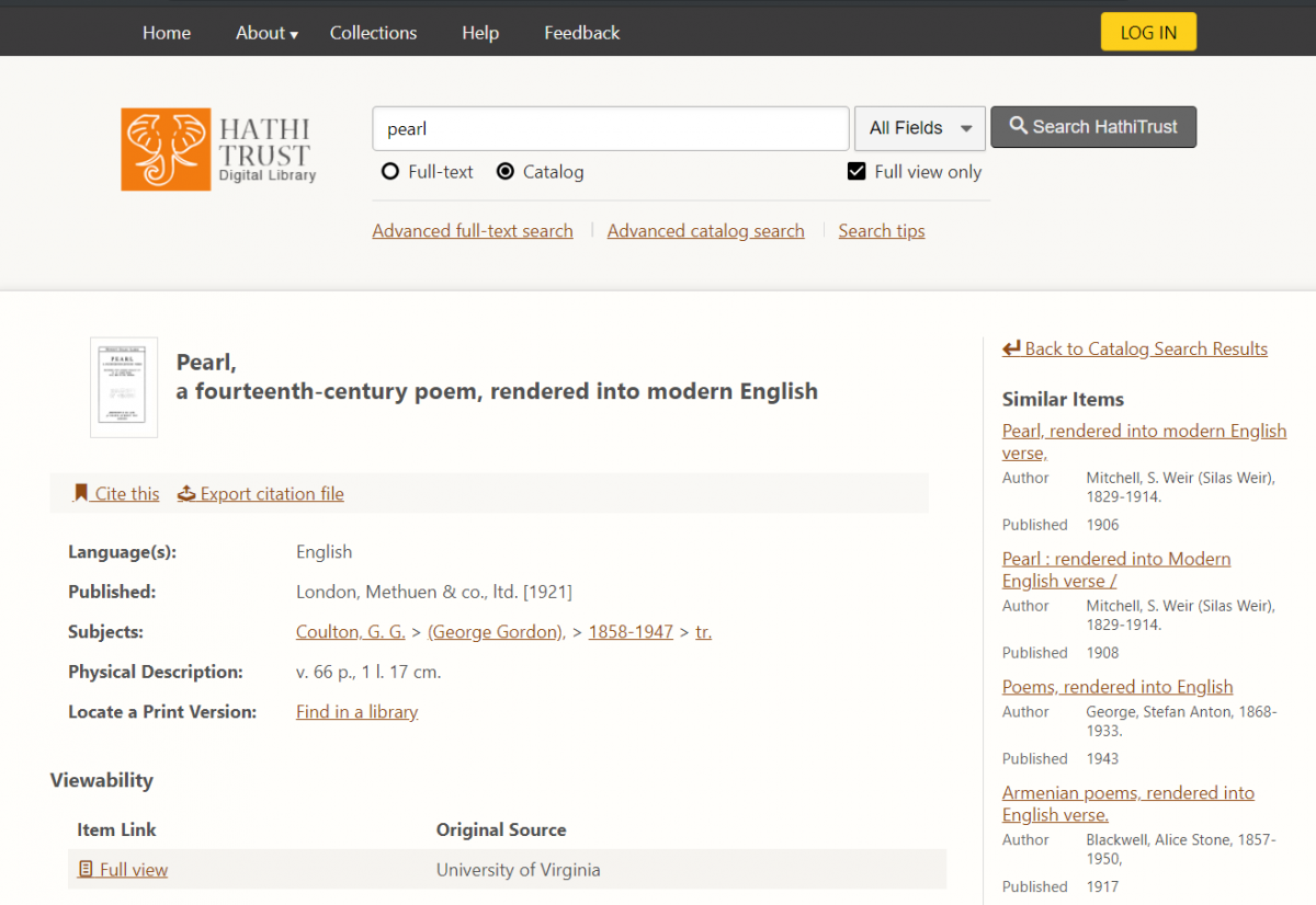
One such feature that has moved is the Similar Items feature in Catalog Records, which has moved from the left side of the screen to the right side. If navigating with a keyboard, you can access this list of items after interacting with the Catalog Record and the list of books associated with the record.
Before
After
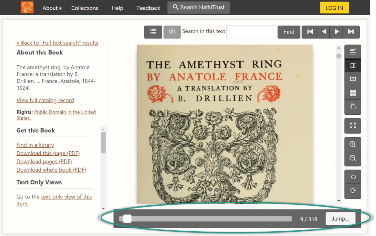
Another feature that has moved can be found in the book display. The “jump to page” feature will now appear at the bottom of the book display, alongside a new scrollbar and the page number display.
Tab focus
If you use a keyboard to navigate the Digital Library, you may notice improvements in tab focus. We supported tab focus previously, but there were sections of a page where the tab focus disappeared. In the updated version, we’ve ensured that tab focus is consistent and visible throughout. Depending on the browser you use, the appearance of the box around the selected element varies.

Accessible popups
Popups in the Digital Library have a different look and behave slightly differently. There were a number of accessibility problems with popup features (example: the “X” to close a book was read as the mathematical function “times” instead of “close”; once a screen reader opened the Jump To Section feature, you couldn’t close it without selecting a section link) which are improved by the new approach to popups.
Before
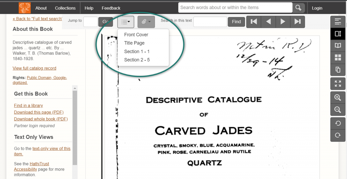
Previously, the Jump to Section feature was a list that appeared above the book page and was connected to the navigation menu above it.
After
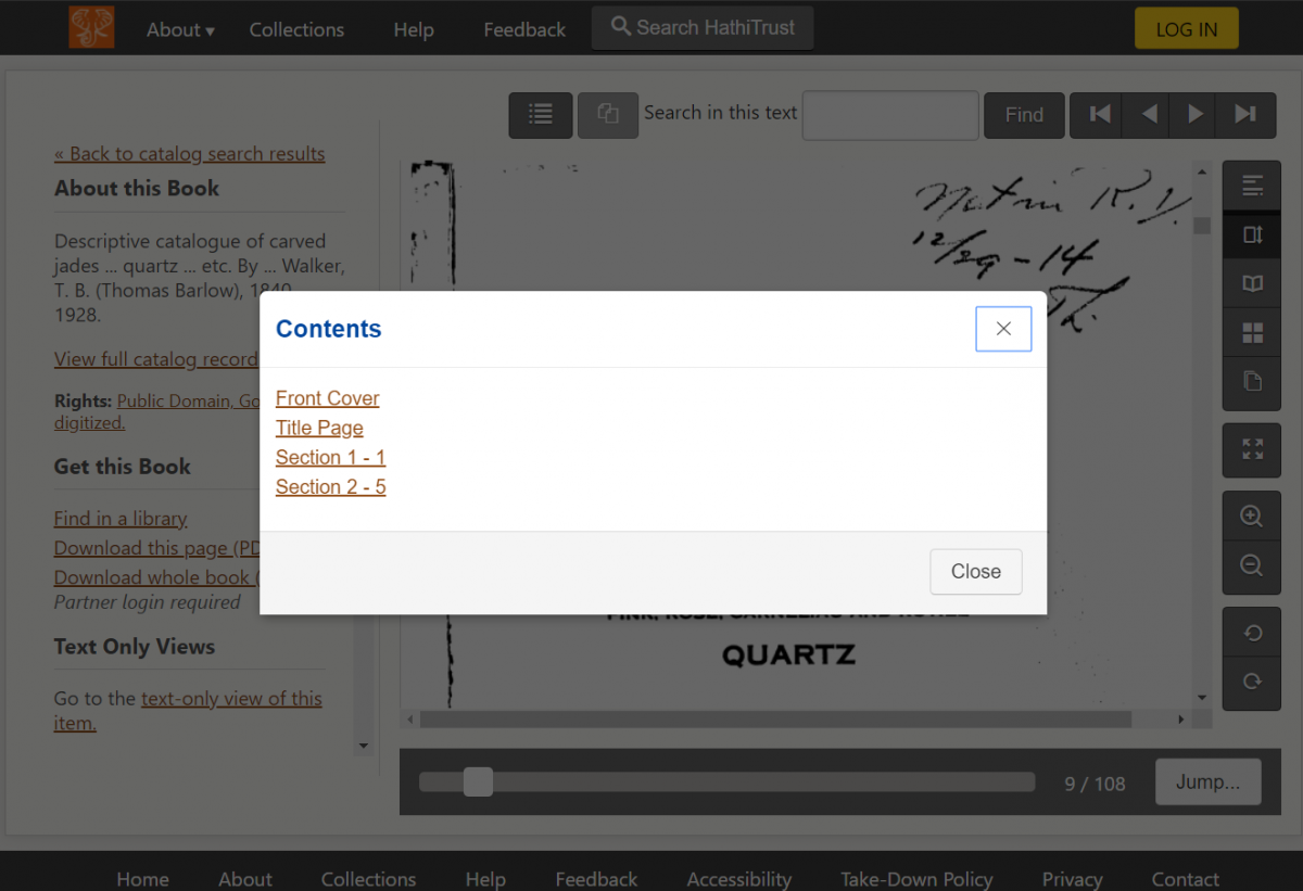
An example of the different approach to popups is below. The popup is a white box that overlays the underlying page, which is shadowed.
Smaller changes
- Miscellaneous improvements to spelling and labelling issues for features detected by screen reader software.
- Better “page loading” graphics in the book display, which will help you better distinguish between when a page is loading versus a blank page.
- The download dialog will provide better feedback to screen readers and sighted users. In addition to the progress bar, the dialog tells users how what percentage of the download has been completed.
Existing Accessibility Features
The above improvements join other features we already support for easier access of the digital library, notably the following.
Skip links
If using a keyboard to navigate the HathiTrust Digital Library, we’ve incorporated skip links in the following tasks. Skip links are the first link that users encounter and allow them to bypass navigation menus and go directly to the content.
- When searching for a book, a skip link allows users to skip the top menus and sidebar of filtering options and to jump straight to the search results.
- When opening a book to read, there are four skip links that allow users to decide what they want to skip:
- “Skip to page content”
- “Skip to text only view of this item”
- “Skip to search in this text”
- “Skip to book options”
Access keys
Users who use access keys to interact with a site may prefer to use the following access keys when reading a book. Access keys allow you to use the keyboard to skip to different sections of the page and switch book views. Each browser uses a different combination of keys to activate an access key. Please refer to Wikipedia for browser-specific instructions on using access keys.
- Access Key 2: Skip site navigation
- Access Key 5: Switch to full text OCR for current book
- Access Key f: Go to first page in book
- Access Key p: Go to previous page in book
- Access Key n: Go to next page in book
- Access Key l: Go to last page in book
ARIA markup
We’ve marked up the digital library following the Accessible Rich Internet Applications (ARIA) protocol. Using this standard helps screen readers and other assistive technology better understand different features and functions of our site and gives users the ability to navigate dynamic content much more effectively.